Palamon
Refreshing a Private Equity brand with a 25 year legacy requires finding the intersection between its past and present
The Challenge
Owners of several household brands across the UK and Europe, Palamon Capital Partners (a London based VC firm) had identified branding and website communication as an early stage bottle neck to potential acquisitions, portfolio sales and talent acquisition; as such wanting to modernise without deviating too far from their heritage as an established brand since 1999.
The Outcome
A strategic rebranding - which aligned all the partners and key stakeholders in a shared vision that included a new logo, colour ways, website, photography and collateral - that not only celebrates Palamon’s past and values, but looks forward towards it’s future.
Client
Palamon Capital Partners
Sector
Financial Services
Expertise
Branding & Identity Design
Squarespace Web Design & Development
Photography
Tone of Voice & Copywriting
UX & UI Design
To find out more about our work for Palamon or any of our other projects, get in touch.
The first task of the project was making a step change that felt like a natural progression for Palamon; to create a brand aesthetic that felt professional, modern and had detailing that was unique to them.
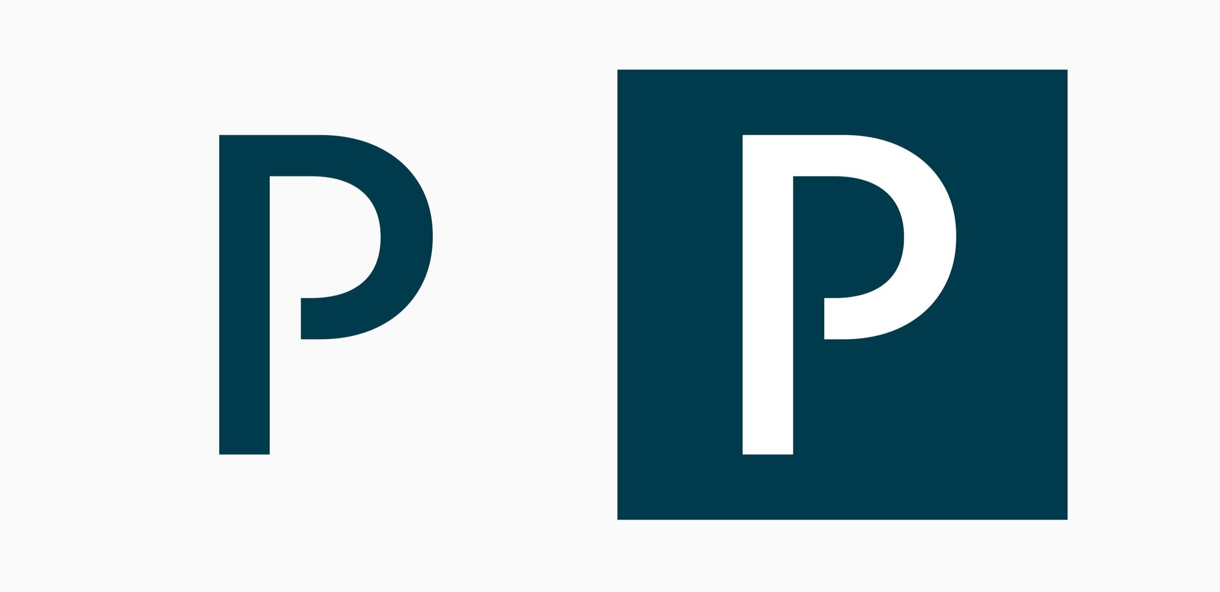
The end result was a new logo with a strong stature; removing the “capital partners” cursive sub text that was in the previous logo. A small cut out in the P created a distinct look that translated nicely into a square image that could be used across socials and the all important favicon.
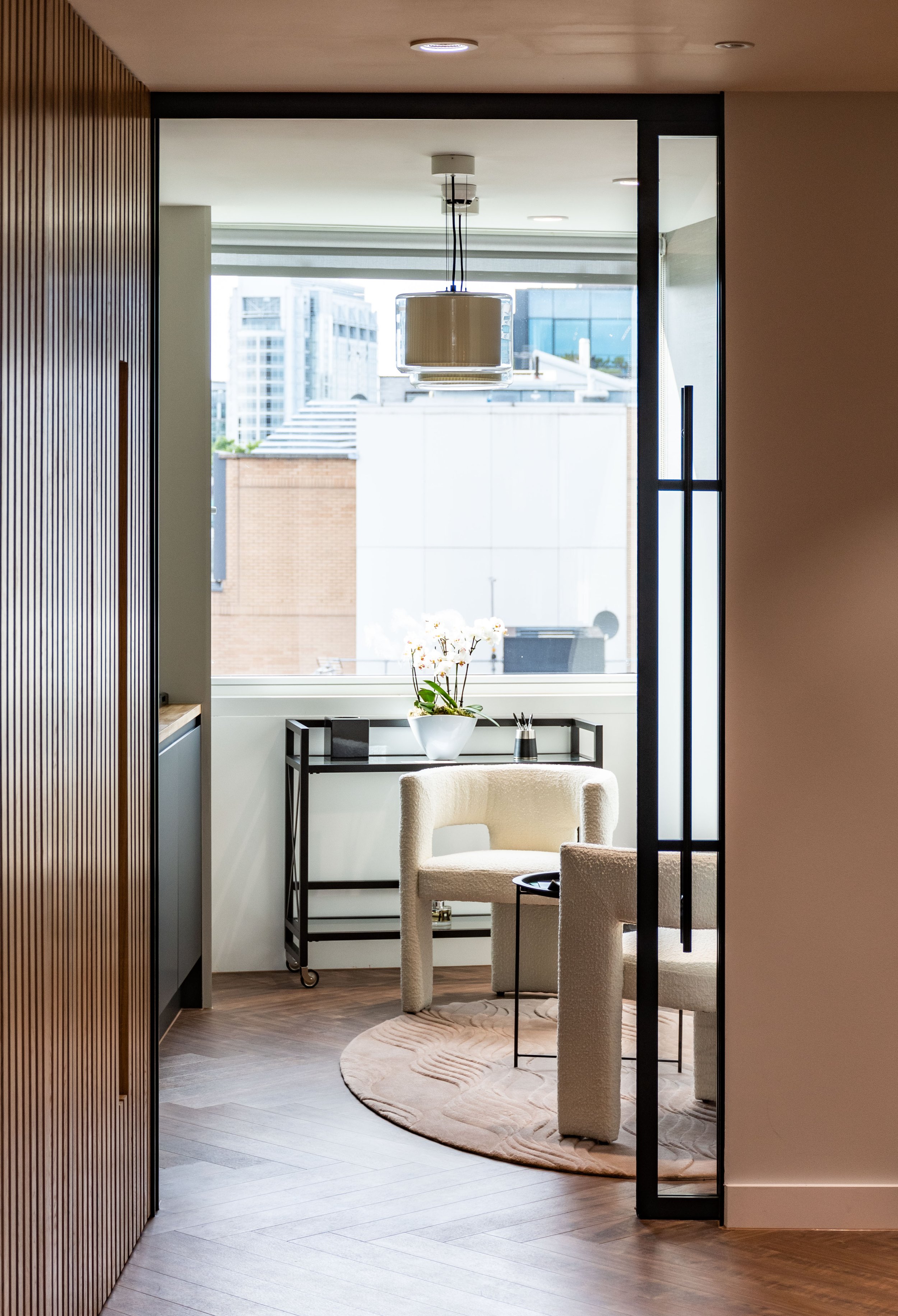
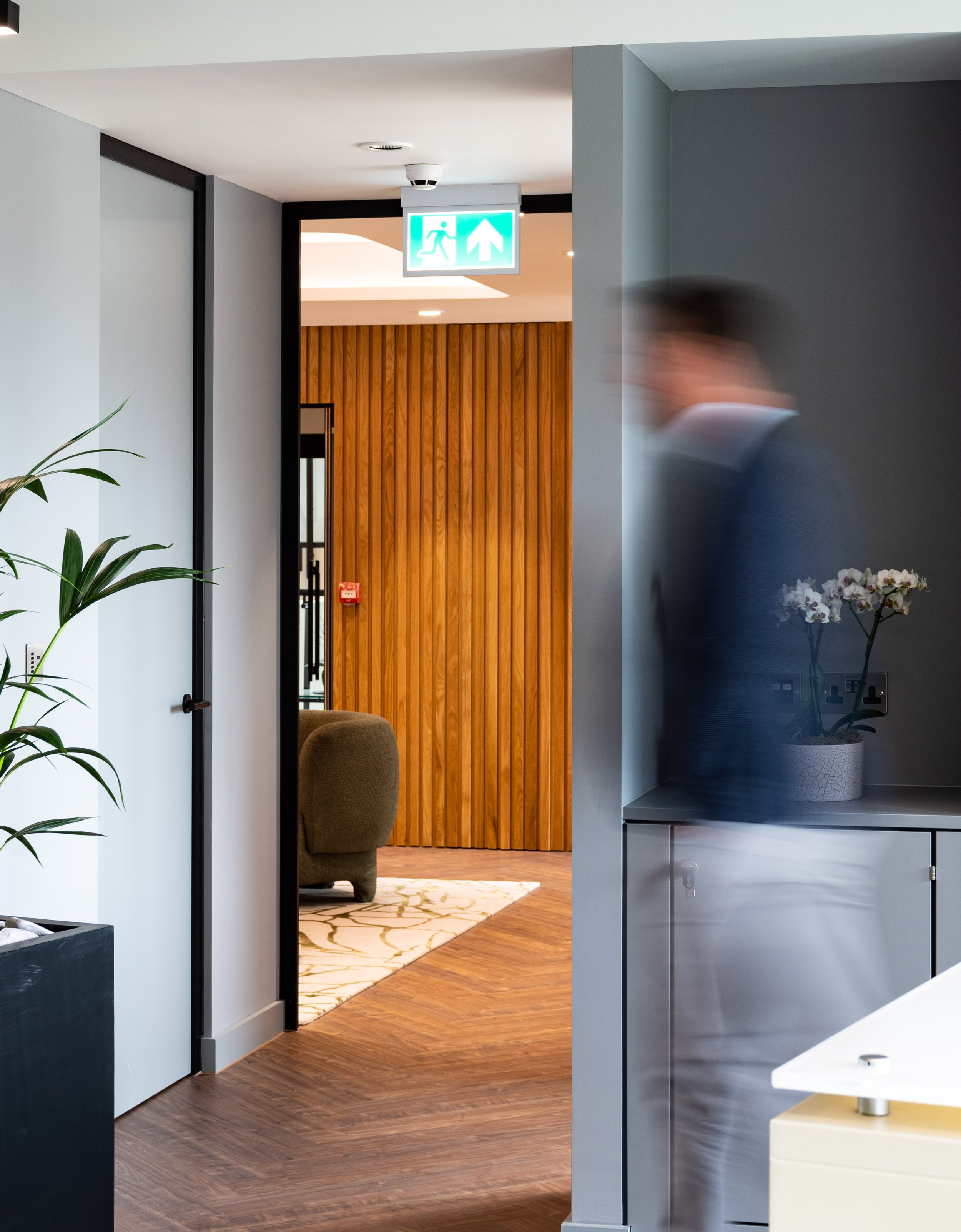
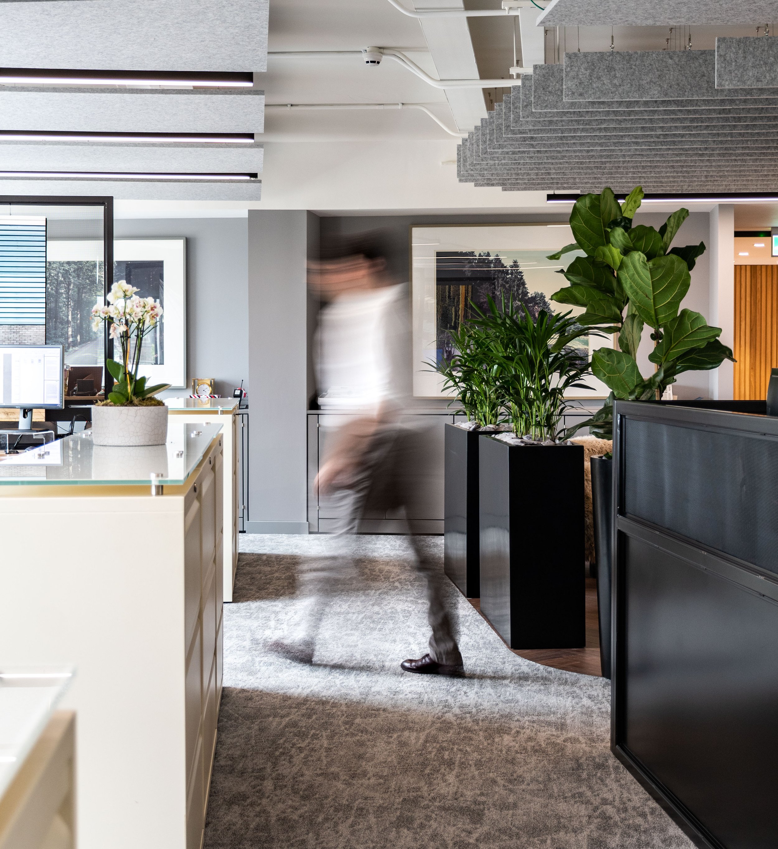
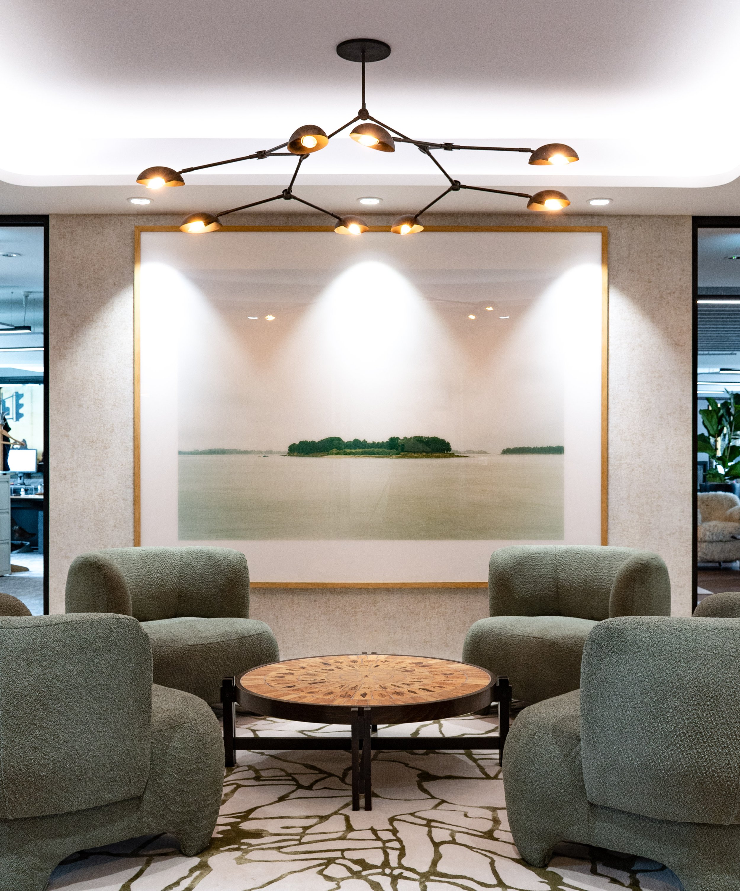
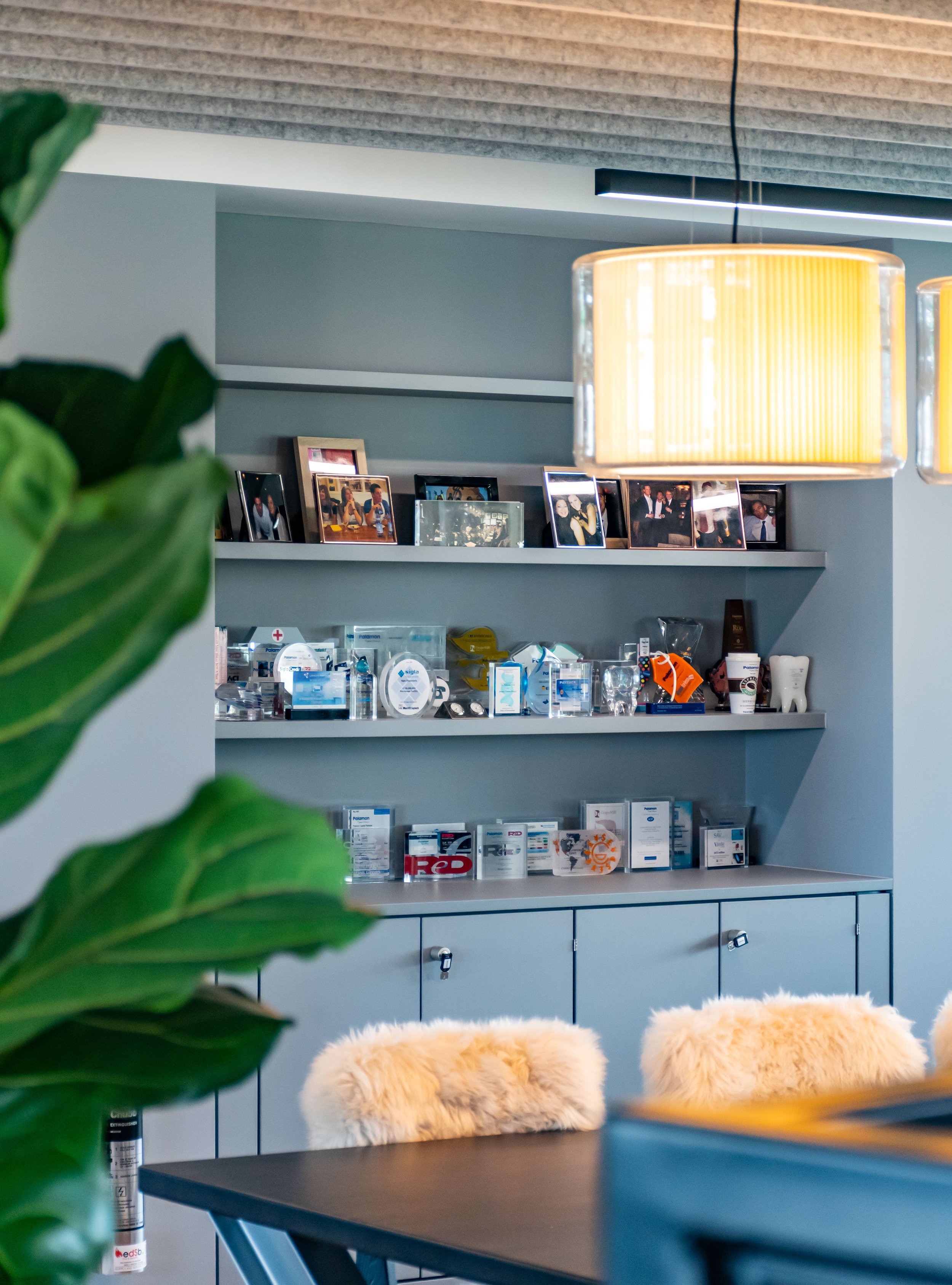
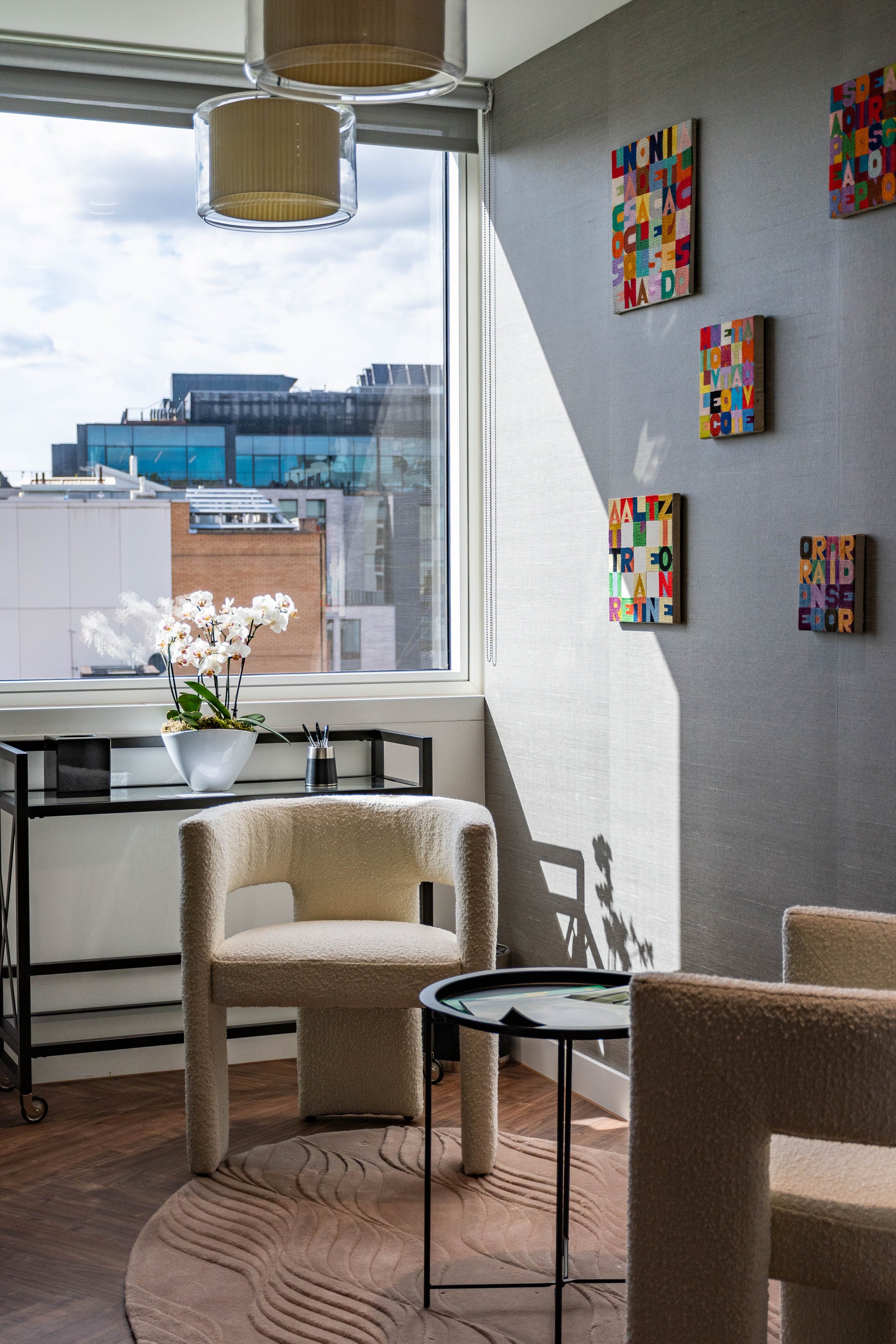
The new primary colour coincidentally matched a favourite childhood toy of founding partner (a tinker toy car in the same blue), whilst secondary colour schemes mirrored the interior of their new Fitzrovia offices.
Strategic Rebranding


Website re-design
The bulk of the project involved building a new website on a new CMS (Squarespace) that would be easy for the team at Palamon to update.
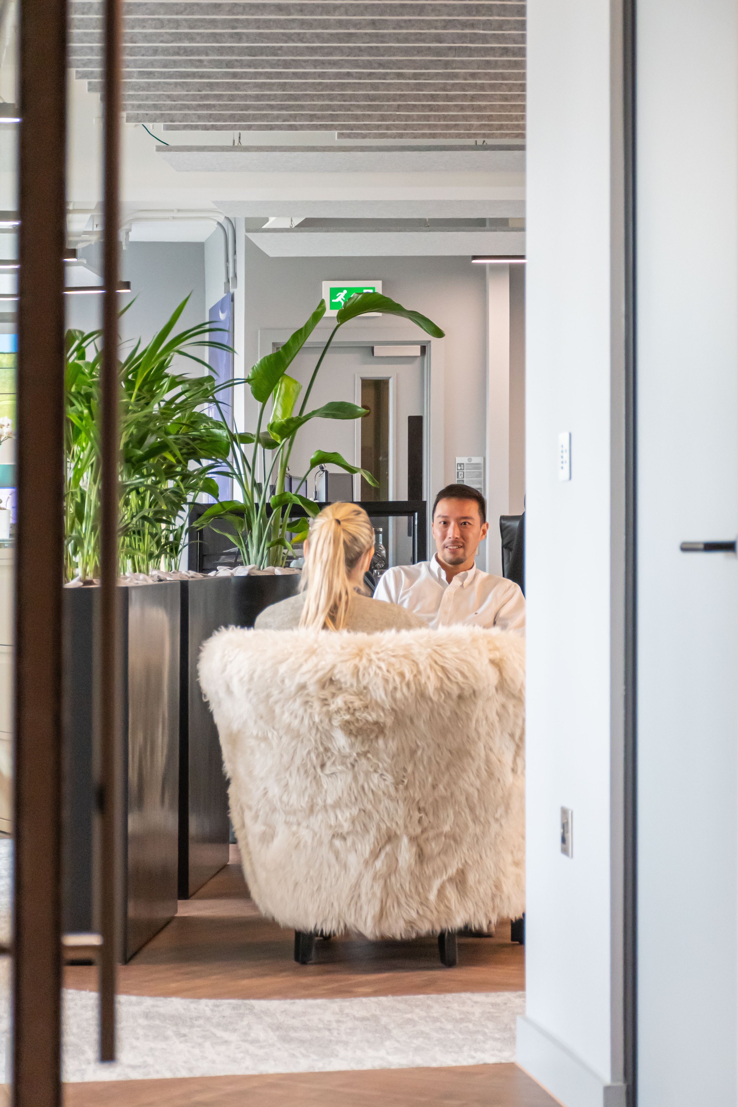
The new website was built to easily communicate who they are and what they do; crafting new key messaging and photography of both the team and their office.
Dedicated pages enable easy filtering of investments and light boxing of pages make for easier navigation without losing track of where one was in the website.
Finally all investment logo’s were collated and unified in look and feel to ensure consistency across the site.


Applying the branding
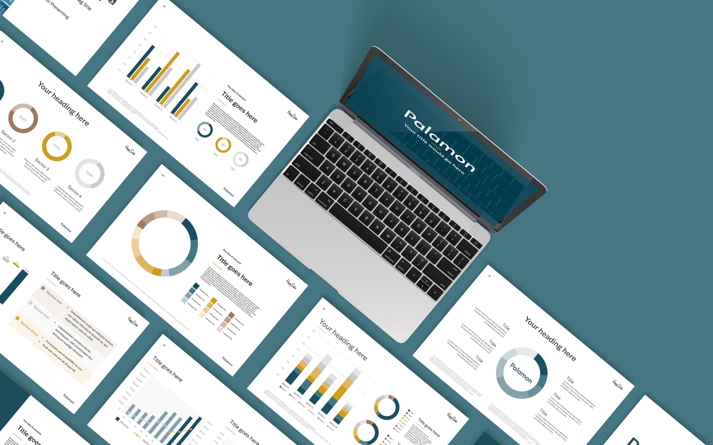
To contextualise and help Palamon translate the logo and colour ways across their internal and external facing assets, we produced collateral extending from business cards to presentation decks

Photography
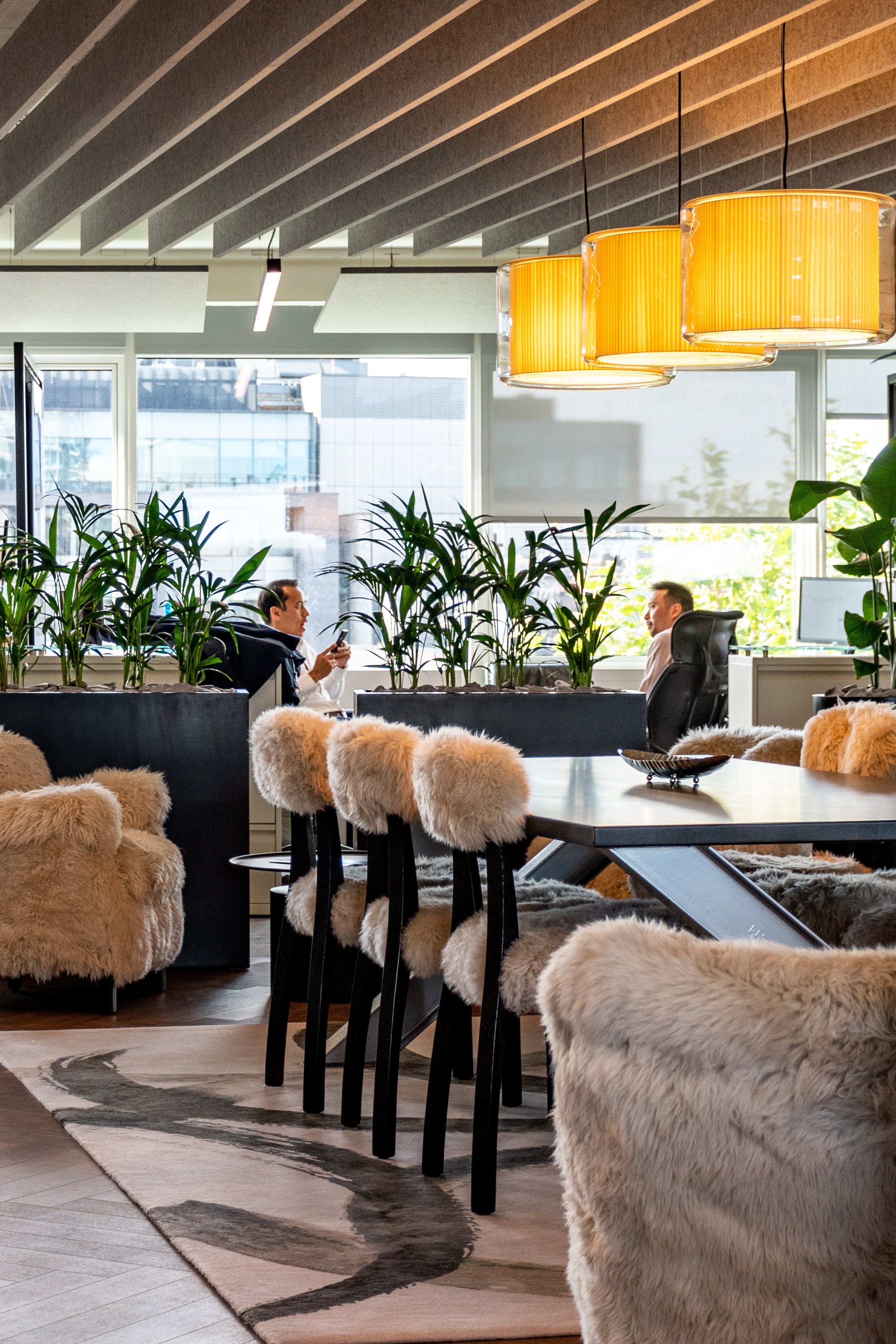
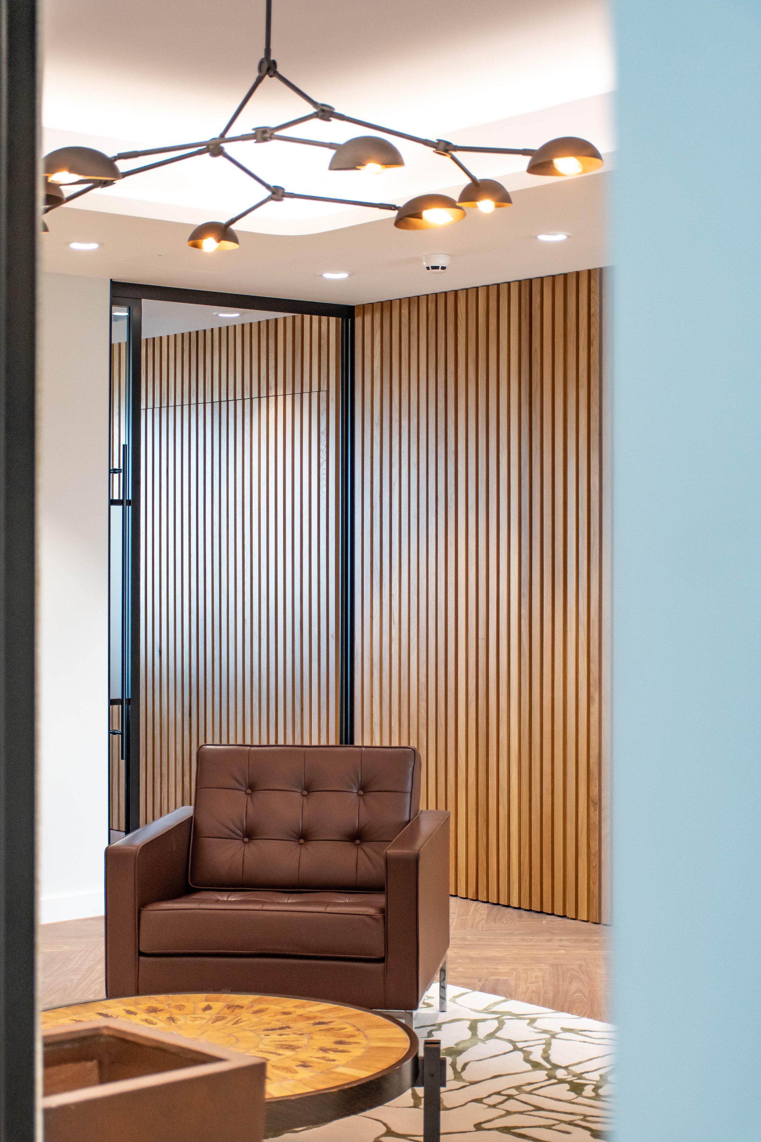
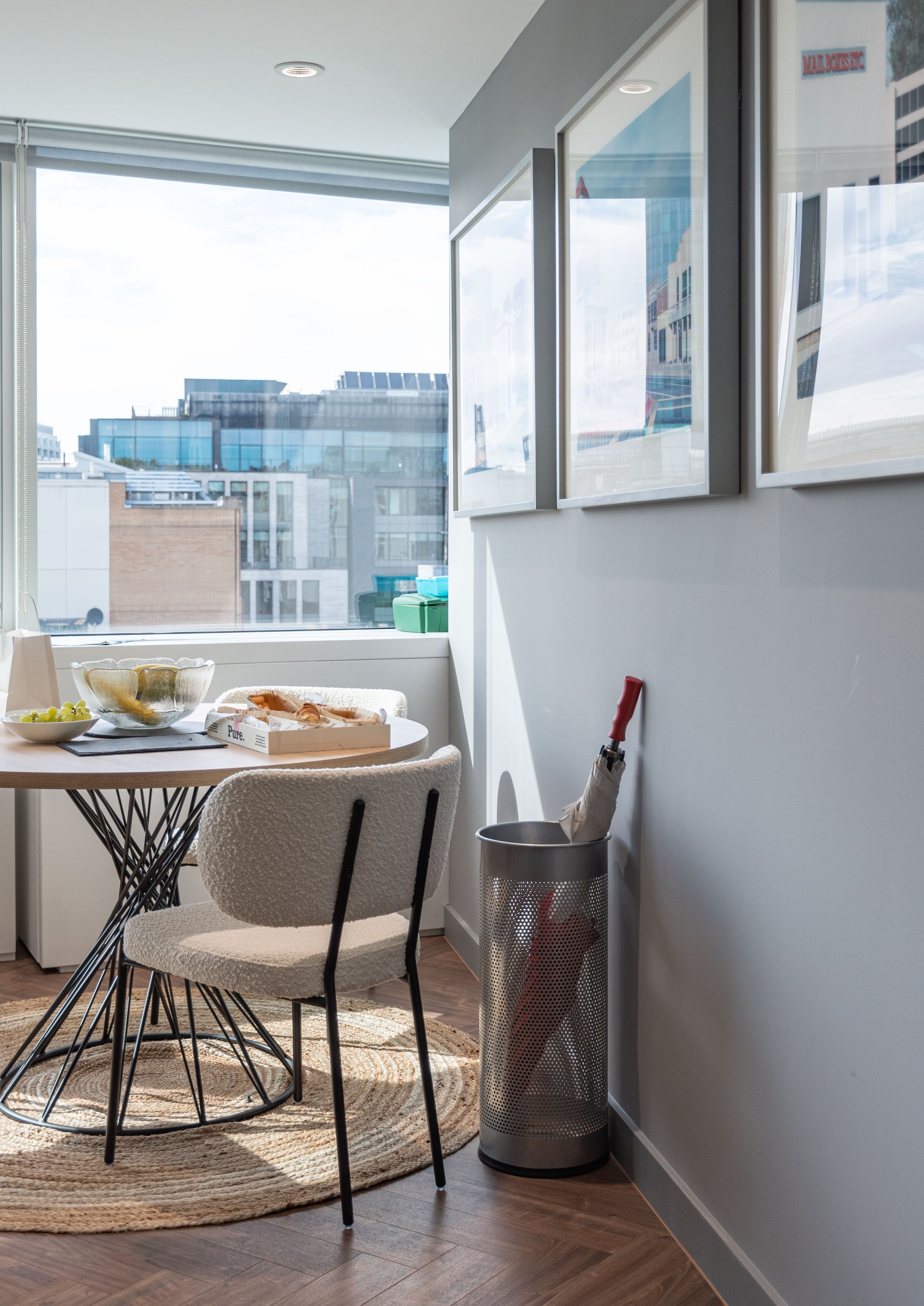
In addition to all new headshots of the team, as can be seen two images back, architectural / interior design imagery was produced to assist in helping an outsider looking in see who Palamon are and the kind of environment they operate within.