HAller
A global approach to creating a sustainable and inclusive blueprint for our planet’s localised future.
The Challenge
Haller’s roots run deep; with over 60 years of expertise, they’ve been rejuvenating landscapes and communities across Africa.
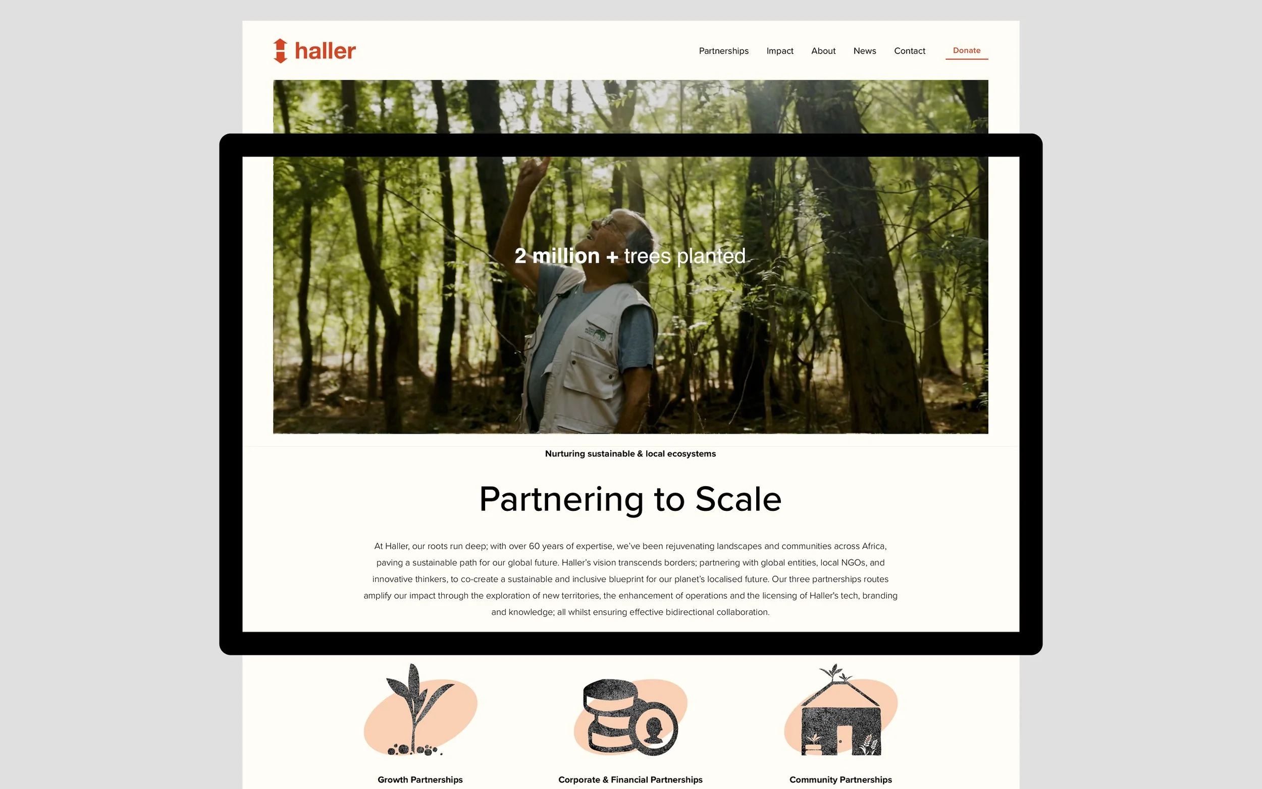
From 2023 they’re looking to scale their impact globally by moving to a social franchise model. In order to do this they need to re-think their digital presence as their slow, hard to update Wordpress website is letting them down both functionally and visually; it’s not making the most of the branding created for Haller by Pearlfisher in 2014.
The Outcome
An easy to navigate, interactive, fast, mobile friendly and information rich website build on an easy to update CMS, Squarespace, that encourages new collaborations, partnerships and donations directly from the site.
Forrest built on top of the initial branding by enhancing graphics, adjusting colours pallets and crafting a new tone of voice.
The end result is a refreshing website and visual language that feels Haller through and through.
Client
The Haller Foundation
Sector
NGO
Expertise
Squarespace Web Design & Development
Branding & Identity Design
Tone of Voice & Copywriting
UX & UI Design
To find out more about our work for Haller or any of our other projects, get in touch.
Before building out the new website, we did a deep dive into what we wanted to say; clearly carving out each page, its purpose, who we’re talking to and combining information together where possible.
We then built out a new tone of voice that brought nature and the earth into the mix - speaking with the wisdom of roots that are deeply anchored in decades of transformative work.
Wireframes set out the page structure, before migrating existing content from Wordpress; we then worked iteratively, finding the style of Haller in the process of building out the website.
Haller’s new website is fast, responsive, easy to update and perhaps most importantly feels authentic to who they are.
Website Refresh
Adapting existing graphics
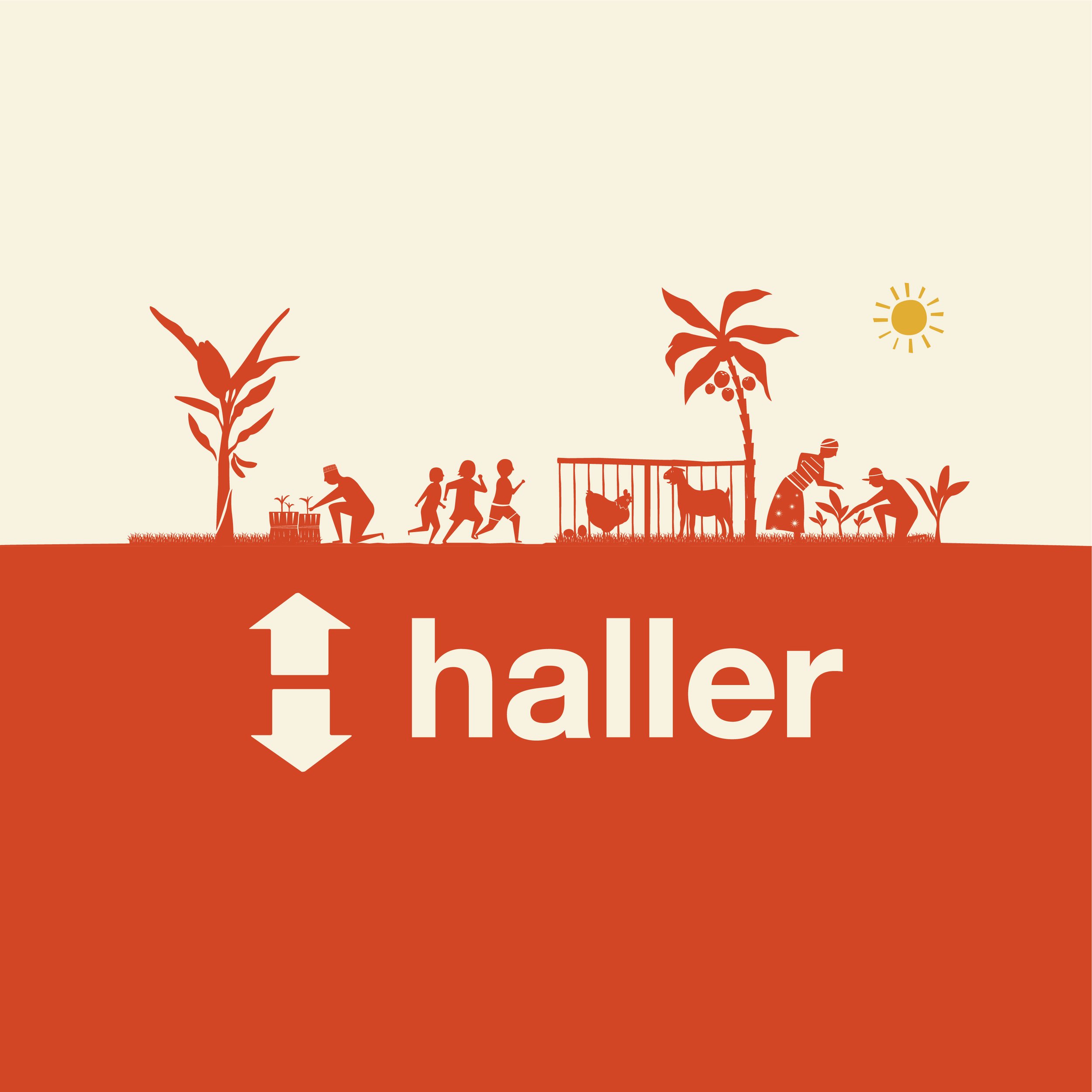
The brilliant Haller branding and graphics were originally made by Pearlfisher in 2014, but they weren’t being used to their full potential.
In order to unlock the branding we had to make assets that worked with the website, rather than making the website work with the existing assets.
In order to do this, we broke the mould of the brand guidelines a bit; shifting several of the colour pallets, combining and scaling graphical elements, removing embedded coloured backgrounds from iconography, eliminating straight lines (where possible) and more; exporting new purpose driven graphics from the original illustrator files.
The result are visuals that feel cohesive and consistent across all of Haller’s website.
Adapting Photography
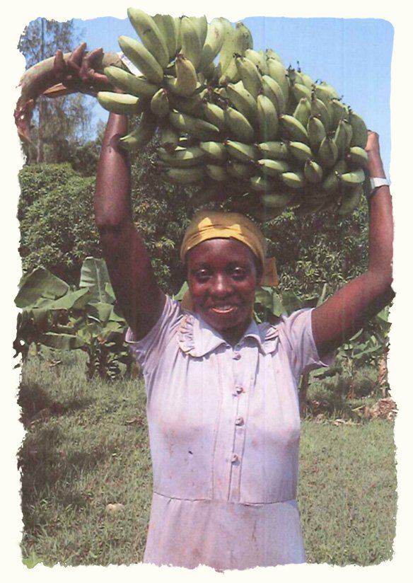
The photography presented a slightly different challenge to the graphics as we wanted to ensure that, where possible, we wouldn’t have straight lines here either.
In order to achieve this, we created a torn effect for the edges of selected photos and integrated the section background colour into them; the results of which you can see below.
